With the editor installed, run your dev
server and click the button on the left edge of the page. The editor opens over your app and closes with Esc
or the close button; your page stays as it was behind it.
Layout
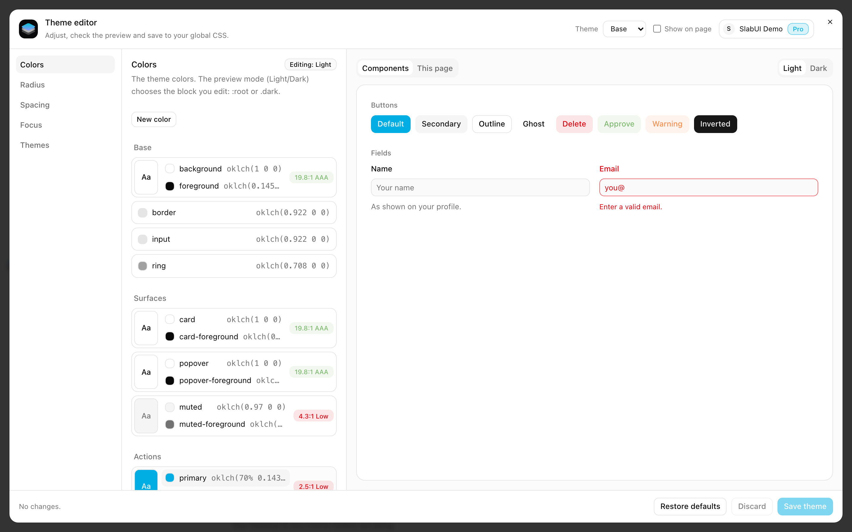
The editor has three columns:
- Sections: Colors, Radius, Size, Focus, Layout and Themes.
- Controls of the open section.
- Preview: your components or your current page, updated with every change.
The header shows your SlabUI account and, in projects with more than one theme, the theme you are editing. The footer lists what is not saved yet and has the buttons to save, discard and restore.
Live preview
Every change shows in the preview the moment you make it: move a slider and the buttons, fields and cards follow it.
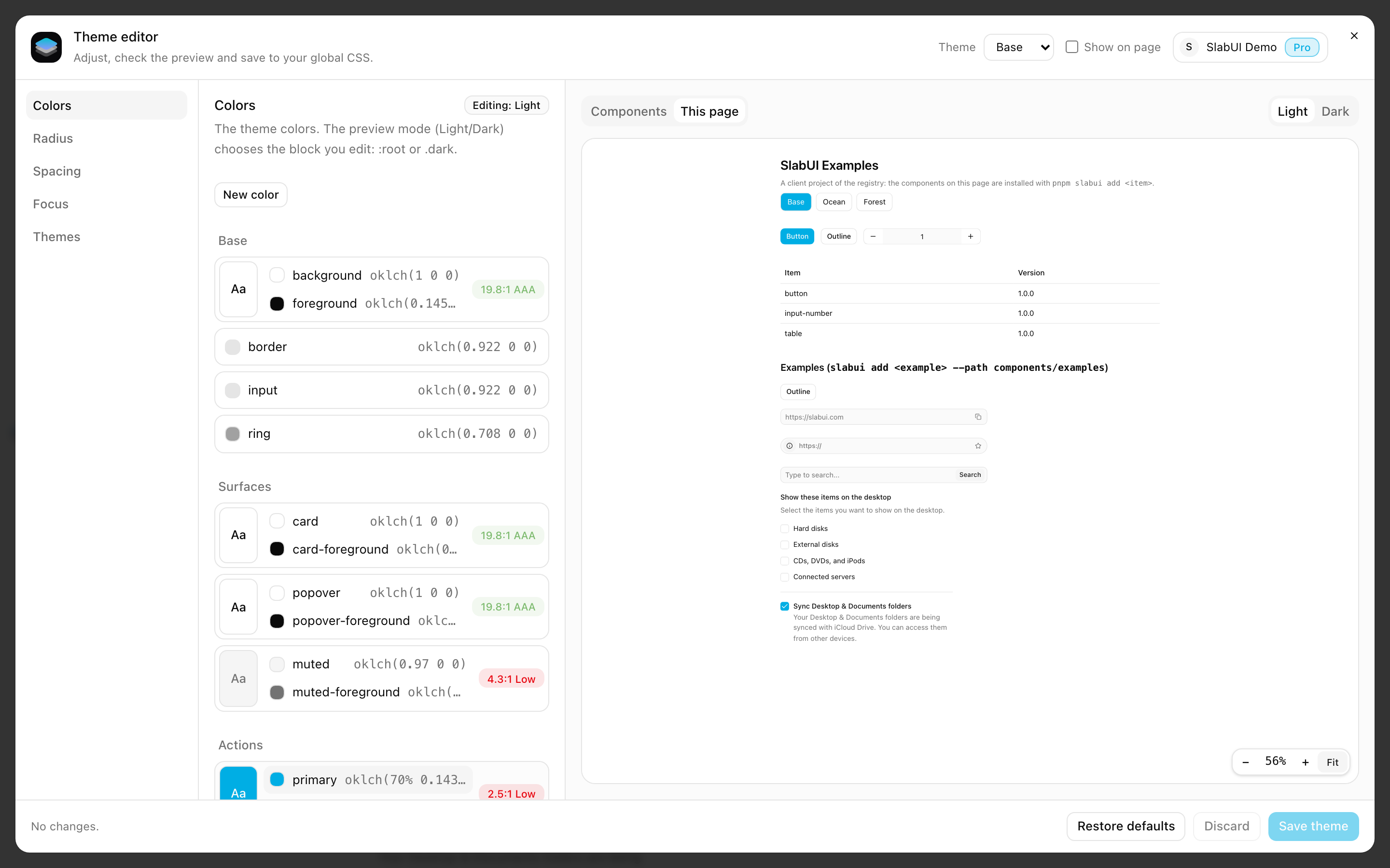
- Components shows the SlabUI components installed in your project that use the value you are editing, so you see exactly what a change affects.
- This page shows the page of your app you are on, with the new theme applied. Zoom in and out (25% to 150%), or click Fit to see the whole width.
- Light and Dark switch the preview between modes. The mode you preview is the mode you edit.
Add your own components to the preview with the preview prop of
<ThemeEditor />:
<ThemeEditor preview={<PricingCard />} />Drafts, saving and discarding
Every change is a draft: it shows in the preview right away, and your project doesn't change until you click Save theme. The footer lists what is not saved yet.
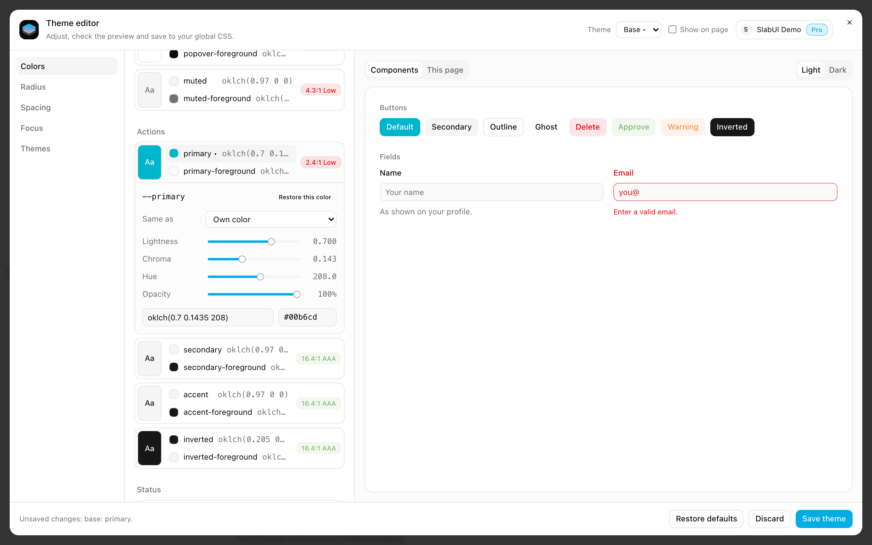
- Save theme saves only what you changed.
- Discard drops the draft and goes back to the saved theme.
- Restore defaults fills the draft with the SlabUI default theme, for you to review before saving.
Drafts survive a page reload in the same tab, so a reload from your dev server doesn't lose your work.
Colors
The Colors section lists the colors of your theme in groups: base, surfaces, actions, status, focus, charts, sidebar and table. Colors that are not in a group go to Other.
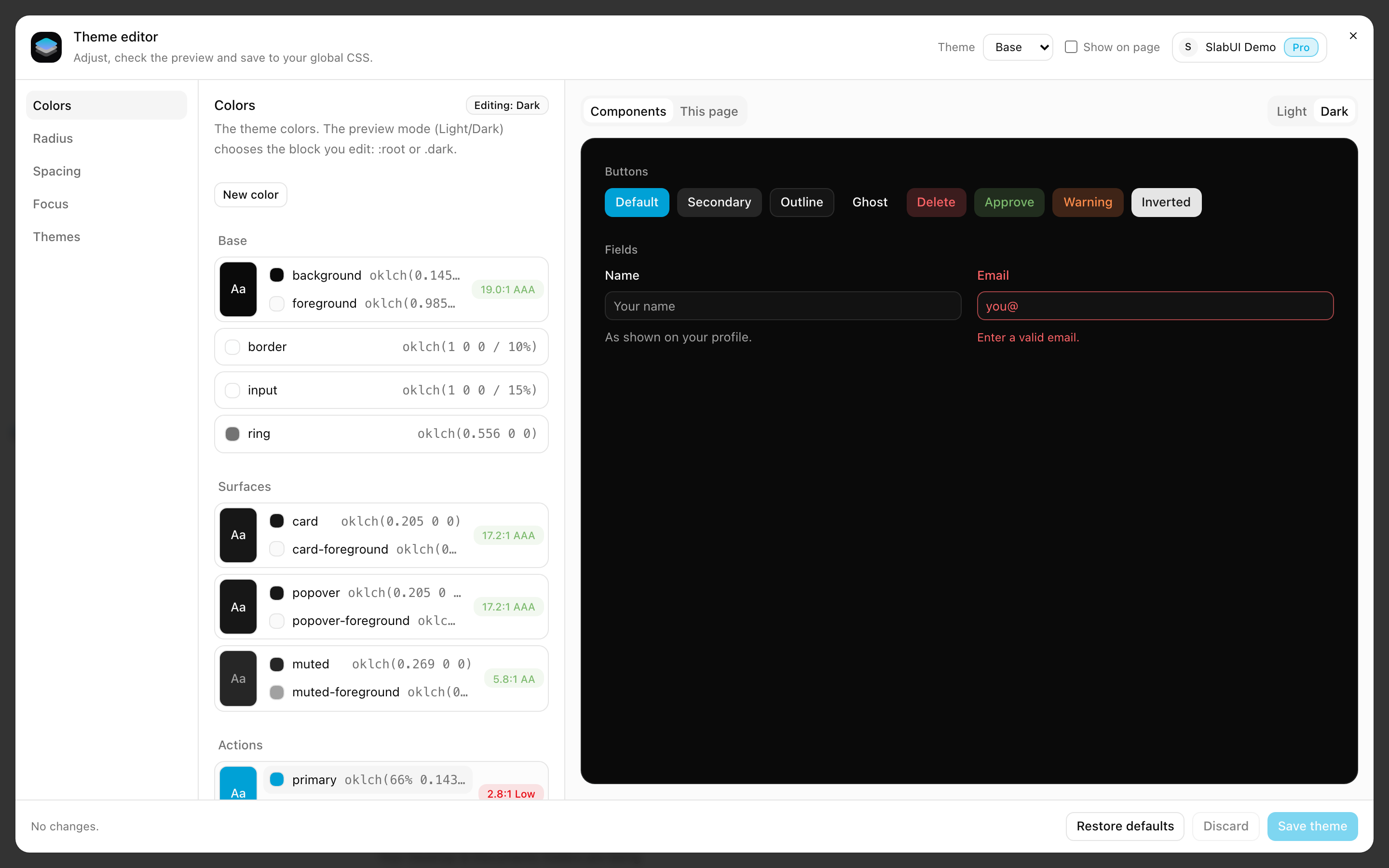
- Pairs in one row. A color and the text that goes on top of it, such as
primaryandprimary-foreground, share a row with anAasample and their contrast:AAA,AAorLow. - Edit in place. Click a color to open its controls right below it: lightness, chroma, hue and opacity, each with a slider and a field for the exact value (opacity in %).
- Any format. Type or paste a color as hex,
rgb(),hsl()oroklch(). The hex value of the color is always shown next to it. - Light and dark. Switch the preview to Dark to edit the dark mode colors.
Colors that follow another color
A color can follow another one: change the original and both change. Type
var(--<name>) in the color value, such as var(--primary) for --ring. The
list shows → <name> for colors that follow another one; moving the sliders
gives the color a value of its own.
New colors
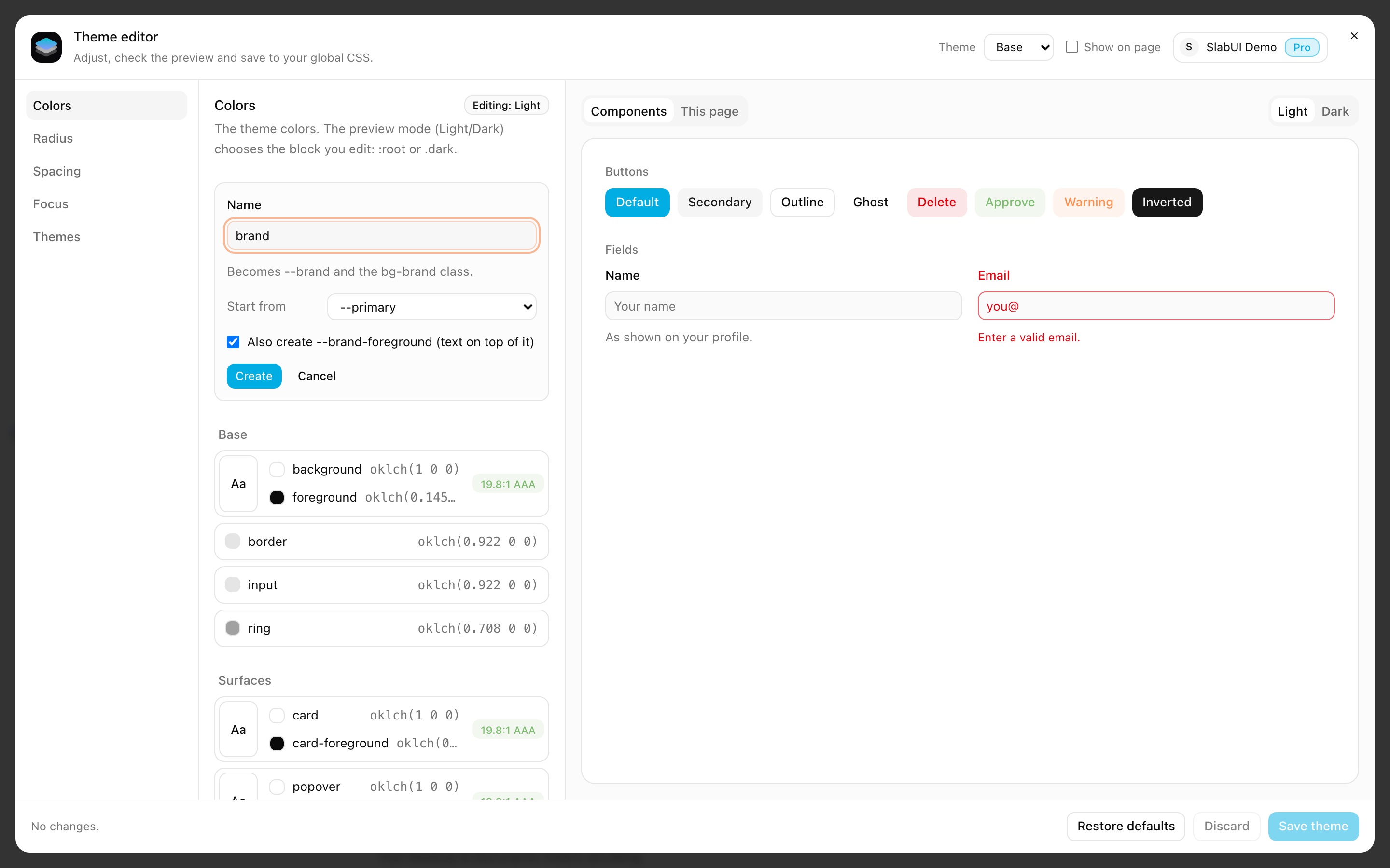
New color adds a color to your theme:
- Type a name, such as
brand. It starts with a letter and uses lowercase letters, numbers and-. - Choose the color to start from.
- Keep Also create
<name>-foregroundchecked to also get the text color that goes on top of it.
The new color is created in light and dark mode, and works in Tailwind right
away: bg-brand, text-brand-foreground.
Radius, size, focus and layout
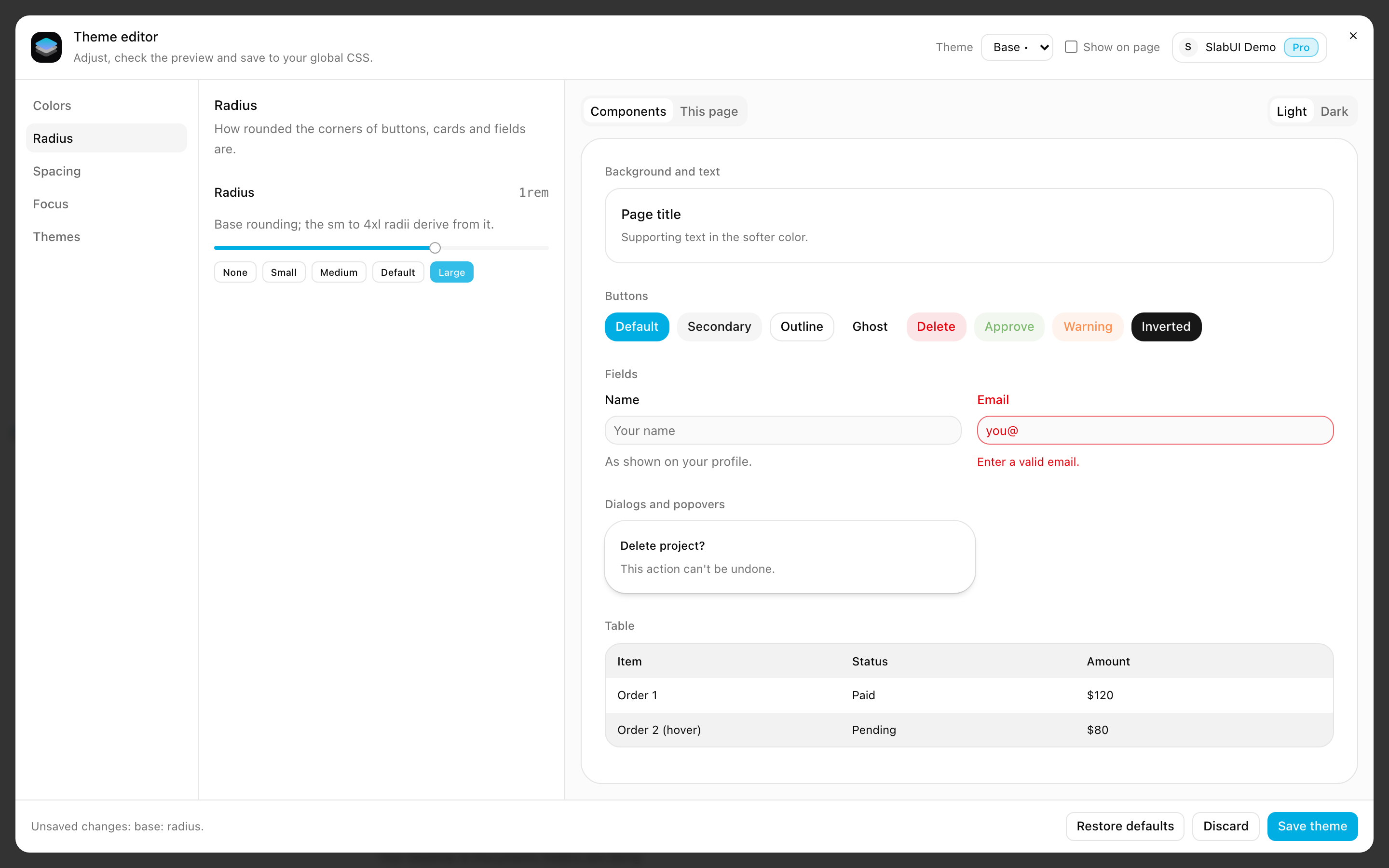
Each one has a slider, a field to type the exact value (with the px equivalent for rem values) and presets (None, Small, Medium, Default and Large for the radius). With the slider focused, the arrow keys move in small steps and Shift + arrow in larger ones. They apply to light and dark mode.
Size has two controls: Spacing (Tailwind's spacing unit) and Text
size (--font-size, the size of text-base; every text-* class follows
it, see CSS files).
Size is a SlabUI Pro feature. On the Free plan, the Size section shows a Pro badge and its controls are locked.
See plansLayout has three controls, in px: Narrow width (--page-sm), Page
width (--page) and Wide width (--page-lg). They are the max widths of
the Container sizes sm, default and lg.
Themes
Themes are a SlabUI Pro feature. On the Free plan, the Themes section shows a Pro badge and the editor edits only the base theme.
See plans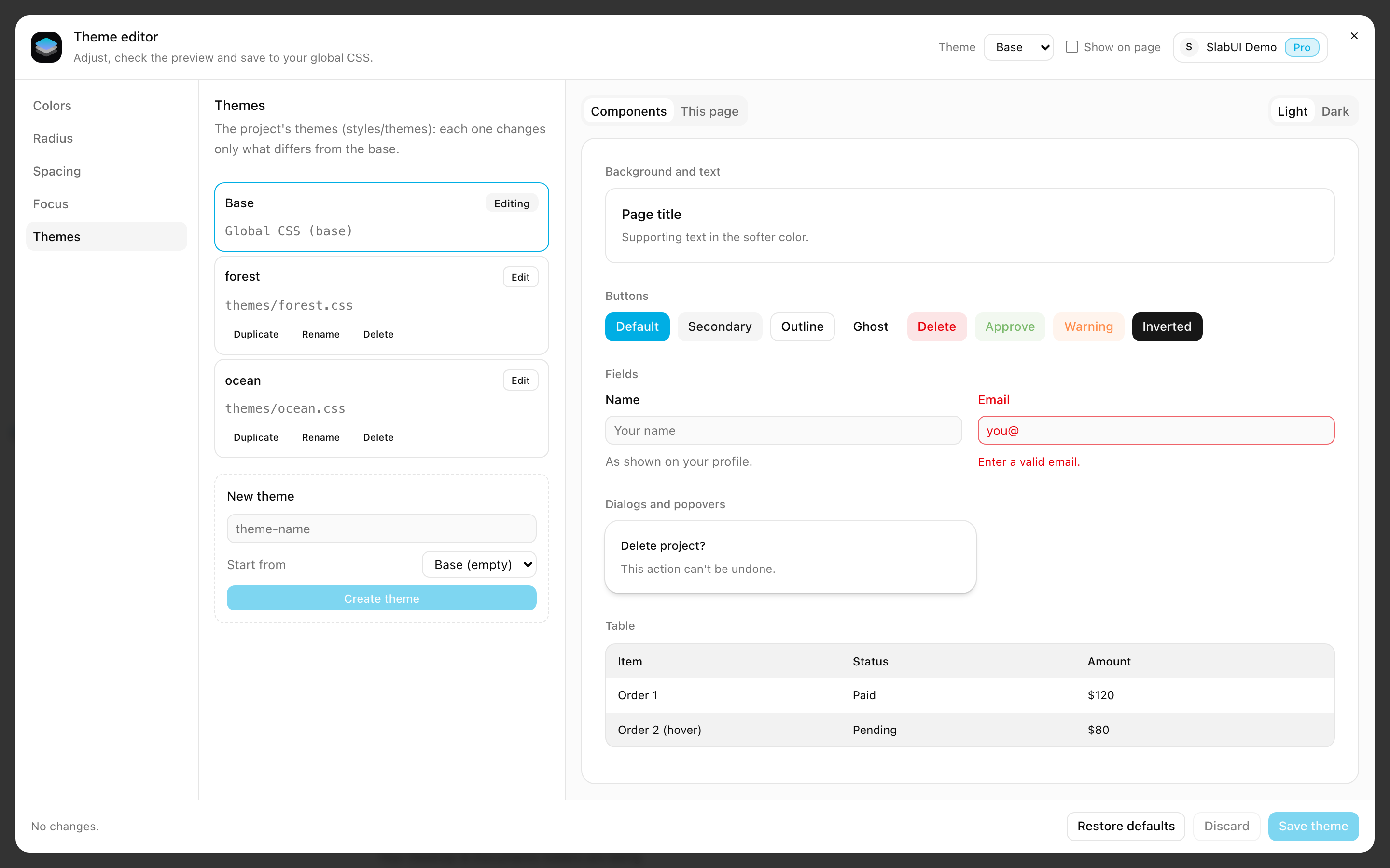
A project can have more than one theme, such as one per brand or per client. Each theme changes only what is different from the base theme. The Themes section lists them:
- Edit opens a theme. Its controls show what the theme changes, and the
rest comes from the base. The theme selector in the header switches between
them too, and a
•marks themes with unsaved changes. - Add theme opens the form to create a theme, empty or as a copy of another
one. Names use letters, numbers and
-. - Duplicate, Rename and Delete manage existing themes.
- How to apply shows how to turn the theme on in your app. See Next.js or Vite.
While you edit a theme, every value shows whether it comes from the theme or from the base. Use the base value removes one value from the theme, and Back to base removes all of them.
By default the page behind the editor keeps its own theme. Check Show on page to see the theme you are editing on the page while the editor is open.
Changes made outside the editor
The editor stays in sync with your project while it is open: changes from your
code editor, a git checkout or slabui add show up without reopening it. Your
draft stays on top, and if a change touches something that is also in your
draft, the footer tells you.